Toxic Expertise Research Group, "The Global Petrochemical Map", contributed by Tim Schütz, Center for Ethnography, Platform for Experimental Collaborative Ethnography, last modified 29 February 2020, accessed 27 April 2024. http://www.centerforethnography.org/content/global-petrochemical-map-0

Critical Commentary
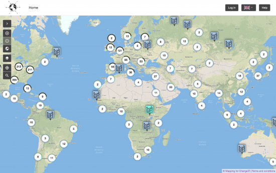
VtP Image 1:
This is a screenshot I made of the "Global Petrochemical Map", an interactive visualization website. The map was created by researchers in the European Research Council-funded Toxic Expertise project. The project team's goal is to "map cases around the globe of major petrochemical sites, local communities, community and labour mobilisations, and details of emissions, environmental and safety records, photos, and media reports."
I came across the map in my search for a "global" view of Formosa Plastics, a visualization that would include all the different Formosa-run facilities. This screenshot, however, shows petrochemical plants across the globe. Certain facilities are highlighted, because they feature extra-information, including both quantitative toxic release information and qualitative data (narrations, images, ... ) submitted by users. While many Formosa facilities can be found on the map, they often feature only either of these types of data – or sometimes nothing at all. It also remains unclear what kind of data – including visuals – might be effective for this kind of website.
The visualization might serve as a reminder for the well-known STS partial view that a "god's eye" view of the world produces. At the same time, it seems to be an attractive point of entry to start mapping out all of Formosa's activities at once.